I used one of the templates on InDesign to create my portfolio because I really loved the color scheme. I changed some of the presets and layout to make it flow better and tie all together in the end. I added a short but effective all about me in the end just so viewers could get a little more background about what I'm studying and my age.
ANNALISA - FMX210
Monday, May 6, 2019
Wednesday, April 24, 2019
Business Cards
Cinemagraph
THIS PROJECT WAS WAY EASIER THAN I THOUGHT IT WOULD BE YET STILL TOOK ME EXTREMELY LONG SIMPLY BECAUSE I WAS OVERTHINKING IT WHILE DOING IT. FOR MY FIRST TIME DOING SOMETHING LIKE THIS I PRETTY IMPRESSED WITH THE OUTCOME. GOING FORWARD, I KNOW THAT I AM CAPABLE OF DOING FAR BETTER WORK WITH SOME MORE PRACTICE.
Monday, April 15, 2019
Calligram pt.2
I re-did the calligram project. I decided on a poem written by Rupi Kaur and used a known outline of the word "love" because she is trying to say that no matter what seems to be going wrong it doesn't mean that you aren't deserving of a happy life. It's about loving one another and being surrounded by things and people that make you happy. I chose certain words and phrases and made them red to emphasize parts of her poem.
Sunday, April 14, 2019
Somewhere
I chose a picture of me from the Florida State Fair and put it in front of a famous Graffiti Mural in Downtown, LA. I absolutely loved the mural and how the wings are painted with full intentions of someone standing in front of them. I had a lot of fun with this, although it was very tricky. There are still minor imperfections that one day I would love to master.
Wednesday, April 10, 2019
Meme
I used an off-guard picture from brunch because we are clearly annoyed at something and what would be a better picture for a meme than this one?! Brunch makes me think of drinking and the caption "when one of your friends say they're not drinking this weekend" came without much thinking. It's like "are you kidding me? how are you not going to drink this weekend with us".
Tuesday, April 9, 2019
Autoscopy
Original files:


Final image:

When I started this project I swore it was going to be so difficult. I pretty much knew what I wanted the end product to look like but I wasn't sure how to get there. As I started to get the hand of it, I decided to just keep going and adding more to it. I ended up combining 3 of my own images, all taken on different dates and in different locations, and combined them into one. I enjoyed this project so much that I might do more for fun!
Monday, April 1, 2019
BW to Color !
Monday, March 25, 2019
Poster
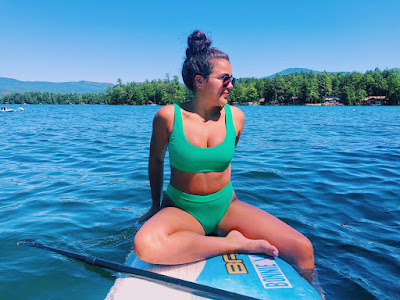
I go to Lake George almost every Summer with our family friends so I chose a photo from when we were last there. I added a fun quote on the bottom to give it a post card feel. It's truly one of the happiest places on earth so I felt that the saying fit perfectly.
Monday, March 18, 2019
Gradient Mesh
Once I finished, I thought back about all the times I restarted my process and didn't actually have to. Quite a LONG lesson learned on gradient mesh! I am still proud of myself with the outcome.
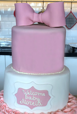
This was a picture of the cake at my mother's baby shower. I would love to master this skill so that next time I would have fewer imperfections and I would be able to recreate ALL details in the photo.
Wednesday, February 27, 2019
Logo
I got lucky while making my logo because I found a font that was almost exactly like what I had imagined in my mind for this project. I typed out the letters and then selected the "V" and moved it so that it overlaps with the "A" so it'd looked like a cursive font.
Subscribe to:
Comments (Atom)
Portfolio
I used one of the templates on InDesign to create my portfolio because I really loved the color scheme. I chan...

-
I used one of the templates on InDesign to create my portfolio because I really loved the color scheme. I chan...


